I look at a ton of Real Estate sites on any given day. Every now and then, I’ll come across a really good one like this one: http://www.joshgonzalez.com (designed by Kristian Themstrup).
But far too often, I also come across some really bad ones! Which is unfortunate because when you consider how much time and energy you put into something that’s supposed to be a marketing tool for you, it’s sad to see all that investment go to waste.
Why does it matter? Because no one…and I mean NO ONE, is going to want to work with you if your website sucks. Think about it. Ever come across a really bad website after Googling a specific term? What did you do, did you stay on the site or did you click away to the next search result? (I opt for the latter and I bet you do to). So yes, design matters.
That said, here’s…
10 Reasons Your Website Sucks (and what to do about it)
 1. Your website header is too big! So much so that I can’t even see the navigation on your page without scrolling. Seriously, there’s no reason your header should be that thick. At the most, it should be about 150 pixels in height.
2. You have too many pages on your navigation. Seriously, 21 pages is too many pages for any site navigation. It’s too cluttered and it’s giving me a headache.
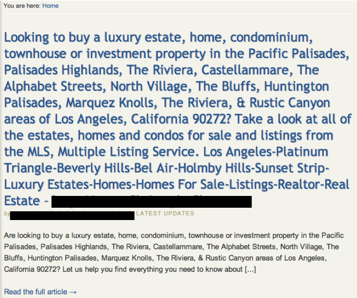
3. You’re stuffing your post titles with way too many keywords. Yes, keywords are important. But is this really necessary??
4. I can’t find your subscription options. So I came across this blog post (probably through a link shared on Twitter)… I read it. It was awesome. And when I went to subscribe, I couldn’t find the damn RSS button! Looked a little further and I’ll be damned… Do you know where it was? It was at the FOOTER OF THE SITE! Not on the sidebar, prominently placed at the top (above the fold) where everyone could see it.
5. Your sidebar is way to cluttered. You got way too much going on there. For a site reader, it’s like sitting at a messy desk or getting into a dirty car. Ok, so my analogies suck but whatever, you get the point, it’s just unproductive and ineffective. Your sidebar should contain your Call To Action(s). The simpler the better and the more likely someone is to actually do what you expect them to. Read: 5 Things Your Blog’s Sidebar Can’t Live Without and How To Use Blog Categories Effectively.
6. You don’t use pictures in your posts. Why does this matter? Well, because pictures help accomplish two things: 1.) a good picture captures people’s attention (this is important), 2.) a good pictures helps tell a better story. So, just as a general rule of thumb, each of your posts should contain (at least) one picture! Try places like Flickr, shutterstock (if you have to) and lastly, take your own photos.
7. Your website plays sound. So, I was on the phone with a client the other day and he said to me: “Ricardo, go to my site: iamawesome.com” So I did. And BAM!! Loud, blaring music. Like I was a concert or driving on the freeway with the top down and the music blaring. Anyway, I couldn’t find the “off” button (their designer did a great job of hiding it). Yes, I could’ve muted my speakers, but what if I was on Skype or something? Then I wouldn’t be able to hear the client. And besides, it’s just plain annoying (IMHO).
8. You use a popup (it’s designed poorly & doesn’t have a close button). One Agent, in an effort to drive site registrations, enabled a popup on every single page of his website. It’s not like it pops up once, recognizes you as a site visitor, and closes out. No. THIS popup comes up on EVERY. SINGLE. PAGE. It looks like crap and then…there’s no “x” button to close it out and hitting the escape key doesn’t work either. Hmm… Wonder how that’s working out.
9. You don’t have any contact information anywhere. So the other day, someone sent me a DM and asked me to call them. They didn’t leave a phone number in their DM so I clicked on their Twitter Profile to see if perhaps it was on their background page (cuz you know, some people do that sorta thing). Nope, nada. So I clicked on their website off of their bio. Check the sidebar, nothing. Click on the “Contact Us” page, nothing. Just a broken contact form and no email address. I tried the About page (you know, just in case)… Nothing. Now put yourself in the consumers perspective, say they read something they like from you and want to get in touch? Shouldn’t you make it AS EASY AS FREAKIN’ POSSIBLE for them to contact you? Whether that’s email, phone, etc.
10. You have a nice design but your content is 6 months old. This one’s the most unfortunate. You nailed it on just about everything (well, with respect to design anyway). Clean navigation, easy Call To Actions, etc. But your last post was six months ago. The next post after that is dated late 2009. Seems a shame to put such a good lookin’ website to waste. Remember: Consistency Matters.
Over to you!
How do you see people (companies) messing up their websites? More importantly, what are some of your suggestions for how they might improve them? The comments are yours… 🙂
I’m off to grab some fresh air!


