I was previously using the Generate Child Theme from StudioPress on this site, and I loved it. That theme was designed for effective lead capture and it worked great. It took me from zero to a few hundred email subscribers for my 7-part email course in the short two months that I had the theme installed.
I’ve tried the following list of services to increase email subscribers:
- Pop-up domination – which displays a nicely designed pop-up ad with your offer and email capture.
- Hellobar – which displays an unobtrusive call to action in a bar on the header of your site (I used this to direct people to my email sign-up page).
- ViperBar – which displays an email opt-in form on the header of your site.
All three are great options, but neither worked as well as the Generate Box via the Generate Theme. That’s probably because it was less intrusive, and not so “all up in your face.” Now granted, the other options probably didn’t work so great because I failed to communicate the benefits of subscribing so I don’t want to discount them as useful options. Still, I liked the Generate theme best.
But I’m OCD and the StudioPress team keeps releasing awesome new themes that make me feel indecisive about which child theme to use on this site. So I’ve changed themes yet again…
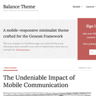
Introducing the Balance Child Theme:

Features Include:
- 5 Color Styles. I’m always a fan of red, thus the red color scheme around here.
- 3 Layout Options. I always use the content/sidebar lay-out option and the landing page template for the tutorials in my 7-part email course.
- Custom Background & Header Uploader. I love this because it makes it incredibly easy for the novice to upload a custom header/background without having to use an FTP client. StudioPress has some free (light) background patterns if you’re looking to play with a custom background. As for the header, as long as you upload an image that’s 960 x 135 pixels, you’re good to go. If you do upload a custom header, just be conscious of how long your tagline is as I had to revert to the dynamic text header here because my tagline was getting cut off on mobile devices.
- Featured Images. I think a blog post should always be accompanied by a strong, complementary image. Especially if you’re using a magazine (two-column) layout theme like this one.
- Footer Widgets. Website footers have evolved from a simple place where you host your copyright information to a section where you can host an extended set of navigation items, links, sources of contact information and more. A point I addressed in this post here. Even if you’re Genesis theme doesn’t come equipped with footer widgets, here’s a great step-by-step tutorial for how to manually add your own footer widgets section to your site.
- Mobile Responsive. In the last month, I’ve only had 14.68% of site visitors visit via their mobile device. My guess is that number could be a lot higher. And the Balance theme does look awfully sexy on a mobile device…just saying.
The Balance Child Theme is the perfect blend of a minimalist design with lead capture build in. It reminds me of the Minimum Child Theme (my favorite theme and the theme I use for Real Estate Blog Topics), except with more lead capture built in.
Favorite Plugins:
Here’s a short list of some of the plugins I’m using to organize, edit or otherwise enhance the site… It’s not a list of all of the plugins I’m using, just a list of the one’s that I think you might find useful.
- Ad Rotator – In short, this plugin allows me to display different chunks of HTML every time you load a page. So if you look at the ads on the sidebar when you load the home page for example, you’ll notice that they are displayed randomly and in a different order every time you load the page.
- Akismet – For spam protection. I activate this by default any time I do a new WordPress install. Akismet has protected somewhere around 44,025,529,554 instances of spam to date. That’s a lot of spam. I hate spam. I’m sure you do too, so get on it.
- Contact Form 7 – I use this plugin to generate the simple form on my contact page. If you want something higher level, and with the power to do more, check out Gravity Forms and this post to see all of the creative stuff that you can do.
- Genesis Simple Edits – This plugin allows me to edit 3 areas easily: 1.) the post-info byline, 2.) the post meta, and 3.) my footer.
- Genesis Simple Sidebars – From here on out, when you load a post on this site, you’ll notice that my sidebar is different than the sidebar on the home page. I’m loading a genesis ad first, then my email opt-in form with options to subscribe via RSS or connect via Twitter. I’m not sure how much else I want to add to the sidebar on individual blog posts but I’m sure I’ll test variations of this to see how it performs. But basically, this plugin makes all of that very easy to do.
- RSS Footer – This allows me to add content to the beginning or end of my feeds. Right now, I’m using it to display a StudioPress affiliate ad. I’m not sure it’s done to well to be honest, so I should probably change it up a bit. But this plugin makes it easy for me to interchange whatever content I’d like to display/advertise to my RSS subscribers.
Here’s what I’ve changed…
The Balance Theme works right out-of-the-box. To activate the welcome and lead capture sections that you see on the theme demo, all you need to do is activate widgets in the “Home Featured Left” section and in the “Home Featured Right” section as seen below:

You can use the “Genesis – Featured Page” widget to display intro text from the About page on your site or you can use a simple “text” widget to tell visitors what your site is about.
For the “Home Featured Right” section, you can use the “Genesis – eNews & Updates” widget if you’re simply using Feedburner to manage your email-to-RSS updates. Otherwise, a text widget with your email opt-in form will do (mine is hooked into Aweber for example).
In my case, I edited the style.css template to center the “Home Featured Right” widget and added a width of 960px so it spans the width of the page. I did that for two reasons, really:
- I didn’t know what to put or link to on the left-hand side, and
- Frankly, I like the look of it as it is now, better.
Other than that, the theme works beautifully and with minimal customization effort (just like any other StudioPress theme).
Feel free to poke around and let me know what you think. If something’s broken, or doesn’t display properly, please let me know so I can get it fixed. Otherwise, I’m going to keep fiddling with the lay-out and sidebars on the interior pages a bit more…
And if you’re into minimalist design and want to build an email list, check out the Balance Child Theme, I think you’ll like it 😉